Aurora HDR Review: Trey Ratcliff’s HDR Software Lives Up to Expectations
If you’ve had even a passing interest in HDR photography over the last decade, you’ve undoubtedly come across Trey Ratcliff, or at least seen some of his images online (even if you didn’t realize it).
Trey is hands down the most well known, and arguably most talented, HDR photographer in the world. He has built his brand Stuck in Customs by displaying incredibly detailed and clear HDR photos from all over the world.
Every time you read the blog it compels you to want to hop on an airplane, buy a new camera, or in most cases, both.
But here’s the good news, you don’t necessarily have to do either to begin getting results similar to Trey’s.
Frankly, it was inevitable. What am I talking about? Well, Trey has become so well known in the HDR world, that it was just a matter of time before he released his own HDR software.
And that’s exactly what he has done with Aurora HDR 2019.
Aurora is the newest and most high profile piece of HDR software to come out in years, and fortunately for all of us photo mortals, it was worth the wait.
The latest version boasts improved performance, speed and features. It also now comes in a Windows version answering the prayers of a whole lot of non-Mac users out there.
Originally produced by a company named Macphun, they changed their name to Skylum in 2017 when they decided to add the Windows version to the mix.
We’re going to take a look at the “Pro” version of Aurora in this review. At $99 it’s priced competitively with other high end HDR programs. Apparently there’s a scaled back “Express” version available for $39 but for the life of me I couldn’t find a download link for it.
Maybe I just missed it or maybe Skylum wants to “encourage” you to buy the full version.
Side Note: Skylum is also trying to capture the general photo editing market with their Luminar program. It’s usable as either a stand alone or as a Lightroom plug-in and covers a lot of the same day in and day out editing chores as Lightroom. It’s one time pricing of $69 also makes it an attractive alternative to Lightroom users who now have to pay an annual subscription fee. But we’ll save that for another review.
In this Aurora HDR review we’ll look at what it is, see if it lives up to its lofty expectations, and take look at how it compares to some of the old HDR standbys like Photomatix Pro 6.
Ready to dig in and see if Aurora HDR is worth investing in? Great, let’s do this.
New Aurora HDR Features for 2018
Most of the improvements in the 2018 version over the 2017 version focus on performance improvements and bringing the Windows version more in line with the Mac version. However, if you’re new to Aurora I think you’ll be generally impressed with the interface, feature set and tools it has available.
We’ll be taking a look at the Mac version here. Keep an eye out for a specific take on the Windows version soon.
OK, enough with the preliminaries, here’s what we found as we put Aurora HDR 2018 through its paces.
Aurora HDR Review: First Impressions of Aurora HDR
After hearing so much about Aurora I was excited to see what all the fuss was about. Frankly I’ve fallen out of love with some of the HDR programs out there so I was excited to see what Trey and his team would do with their fresh take. Full disclosure here…I really wanted to like it.
The Aurora HDR download was quick and smooth and I had no issues with the install. So far so good.
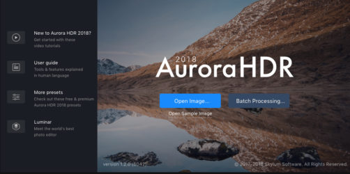
The startup screen gets you quickly to links for a huge variety of user guides and instructional videos if you want them. I thought these were particularly well produced and informative, not only on basic operation, but also on a variety of creative scenarios. Good stuff here.
There’s also a link to the Aurora Marketplace where you can access some additional presets. It’s a little on the limited side so far but hopefully this is something Aurora will continue to update and add to.
On the overly aggressive marketing side of things they’ve included a link to Luminar, their photo editing program. Maybe a little heavy handed but possibly worth a look considering how well integrated with Aurora it claims to be. See the link above.
For those of you who can’t wait to try it out they’ve also included a sample set of brackets for you to play with.
Creating My First HDR Image in Aurora
Getting started with Aurora is pretty straight forward and typical of other HDR programs.
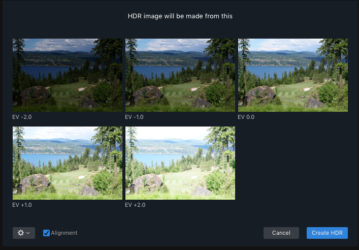
Select your images and here’s your merge view:
I thought the Alignment checkbox was pretty easy to miss if you’re not paying attention and the default seems to be “unchecked”, so be aware.
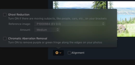
This is also where you get a drop down menu for Ghost Reduction and Chromatic Aberration Removal.
If you’re in a situation where you have movement within or between the frames such as moving cars or people, Ghost Reduction is where you take care of it. Aurora will help reduce or eliminate the blur you would otherwise get when combining those frames that include motion.
Chromatic Aberration is a kind of color fringing created by the lens in very high contrast transitions.
I’m a little on the fence about needing to select a specific frame at this point to base Ghost Reduction on. A little more feedback here would be nice. Since there’s no preview function like Photomatix Pro has, if you don’t like the result of the merge you’ll basically have to start over.
In any case, punch the Create HDR button and away you go:
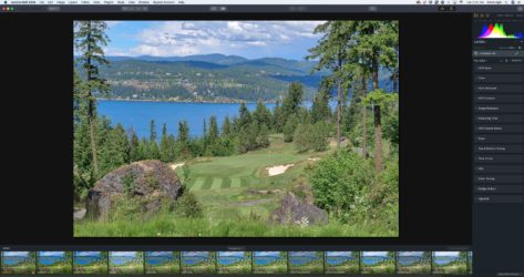
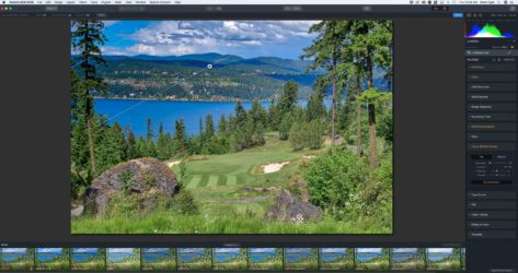
This is where I think Aurora really starts to shine. I immediately felt comfortable with the layout of the presets, and other features. For as much as I still like Photomatix for some things, when comparing it side by side with Aurora, it’s pretty clear that Aurora has moved way past the dated looking Photomatix interface.
The presets are arranged in a row at the bottom of the screen with edit controls lined up on the right. Tools for magnification, comparison, crop and history are on top.
I think the organization is much better and more intuitive than I’ve seen elsewhere, not to mention Photomatix doesn’t even have a history function and it’s magnification tools are a little clumsy at best.
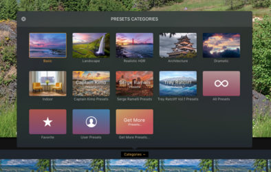
The stock preset categories seem to be well organized and descriptively named.
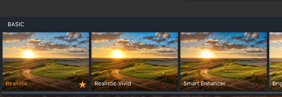
I’m not sure it’s really designed this way but the presets seem to be arranged left to right from more realistic to more enhanced or “artsy”. If you’re looking for a more natural look you’ll probably want to start with the leftmost preset (conveniently already named “Realistic”) and start your edit from there.
However, once you select a category the nomenclature sometimes gets a little dicier.
The standard categories make some sense but once you get into the “designer” presets contributed by people like Trey Ratcliff and Captain Kimo, you get names like “Egg Yolk Mishap” and “Pigeon”. Suffice it to say you need to rely on the small preview thumbnail and trial and error to find what you like with these. As a personal note, these are probably not presets you should ever plan on using anyway.
Before you even touch the deep array of editing tools you have access to, you get an “amount” slider accessible on the preset thumbnail that gives you the ability to reduce the overall degree of the selected preset. In many cases I found that a couple of clicks to the left or right with the slider was all I needed to get where I wanted to go.
Tools in Aurora HDR
Since we’re not doing a tutorial here I won’t go into a tremendous amount of detail but the tools available at this point are very well thought out and allow you to create just about any effect you can imagine. Here’s the “collapsed” view.
I liked the range and flow of the effects tabs and the broad range of adjustments available to make tweaks to any preset. The stock adjustments that have been used to create the selected presets are highlighted so if you want to tweak those specific settings you can go to the dropdown menus and fine tune from there.
The collapse/expand view of each is a nice way to keep your workspace a little less cluttered feeling as you finish with individual settings.
Of course if you want to add additional effects or make adjustments from the other menu items you can do that as well.
All of the tools you have available here are very well thought out and have descriptions that seem logical and easy to understand. The ability to easily collapse and expand the categories also makes it a bit less overwhelming if you’re just getting up to speed on the interface.
Some of the highlights in the toolbox include:
Layers
The ability to create and stack layers within a project gives you an incredible amount of creative flexibility and allows for non-destructive changes or fine tuning within each layer.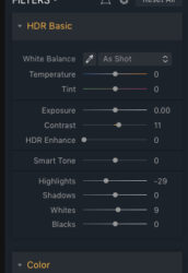
Lens Correction & Transform
Here’s where you can make adjustments for specific lens problems as well as correct for leveling issues in your frame.
The Lens Correction function is where you can take care of issues like barrel distortion and pincushioning. This is also where you can correct for color fringing and Chromatic Aberration.
The Transform function will come in pretty handy for correcting for things like wide angle distortion and unlevel framing. One minor quibble is that you’ll have to do some manual cropping once you’ve made your corrections
HDR Structure
This gives you some additional control over the overall HDR effect, particularly in terms of fine tuning the detail areas or “microstructure”. It felt like this feature allowed you to change some of the subtleties of the effect that is sometimes missing in other HDR effect sliders.
Tone Curve
If you prefer to make your color adjustments with a curve tool, you’re good to go here.
Polarizer
A nice touch that will allow you to create additional control over the contrast and saturation of sky and water elements by simulating an actual polarized lens filter. I thought it worked pretty well for quick enhancement to an area that is where you often end up concentrating anyway.
Ability to toggle adjustments on and off individually
If you want to do a quick before and after comparison of an individual effect this is an easy way to do it. Just turn it on or off to see the difference. You can also reset these parameters with the click of a button.
Top and Bottom Tuning
Another nice feature, this allows you to set a gradient area at the top and/or bottom of a frame giving you the ability to simulate a graduated color or neutral density filter.
Dodge and Burn
For those of you who recall your film darkroom days with fondness and a bit of nostalgia, Aurora has you covered with their dodge and burn tools. This can be really handy for brightening up or darkening down specific areas of the frame using a brush tool. Be aware though that none of the brush tools are currently “edge aware”.
This means that as you brush along a portion of a frame the program will identify hard edges and “color within the lines” so to speak. This can be pretty handy when you’re working on something like a city skyline or something where you might want to apply an effect to the sky but not the buildings. This is an update promised in a future release.
How to Finish Your Images in Aurora HDR
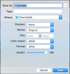
On the way out you’ll have options for sharpening and resizing your images as well as options for color space and format depending on what your plans for the finished image happen to be. I thought the output quality was high even when tinkering with JPEG quality if you have need to control file size.
Things I Like Most About Aurora HDR 2018
There were a lot of things I liked about Aurora HDR 2018 but here are a few highlights:
Easy integration with Lightroom
Tailored to both beginners and advanced photographers.
I didn’t feel like I needed to do a lot of additional editing after processing a photo. Good result as a stand alone program.
User Interface
For me this is hands down the best HDR user interface on the market. Logical, intuitive and feature packed, I found I was able to get around in Aurora quickly and practically effortlessly from the very beginning.
Dodge and Burn
Having a tool to quickly knock down or brighten up small, specific areas of a frame is a great feature.
Layers
A really important tool that gives you the ability to create non-destructive layers you can stack and the turn on or off at will to fine tune details as you build up a potentially complicated composite.
Polarizing Filter
I thought this was a handy and effective tool to quickly enhance sky and water elements in the frame.
Before and After Mode
It’s easy to review your before and after view with either a keystroke to toggle back and forth or to grab a bar and be able to do a sliding split screen evaluation. Since it’s sometimes easy to forget where you started this can be a great way to keep track of what changes you’ve made.
History
Having a history list makes it easy to go back in time to revert to a specific spot in your project.
Things I Didn’t Care for in Aurora HDR 2018
Although it’s hard to fault too many things about Aurora here are a couple of nitpicks:
Presets
I had a little trouble finding presets that I thought were perfect “right out of the box”. That said, there were several that were close enough that I only had to make minor tweaks to fit my personal aesthetic.
Preset Slider
Another minor gripe, but the slider bar under the preset thumbnails is really thin and sometimes hard to grab onto.
Final Thoughts on Aurora HDR Software
I’ve probably said it a dozen different ways so far but this is by far my new favorite HDR editing program. Between the updated and user friendly interface and a slew of unique and useful tools, Aurora HDR has set a new bar for what’s going to be expected of others in the future.
Grab Aurora HDR at the Skylum Website Here.
Good Things
- Excellent user interface
- Nearly every feature you could want
- Works seamlessly with other programs
Bad Things
- A little spendy in the Instagram world we live in
- Many of the presets felt pretty useless


There are no comments
Add yours